Google Maps Updated With New Look to Make Finding Places Easier
An announced update to Google Maps on Thursday brought a partial redesign that aims to make it quicker and easier for users to find places depending on their usage.

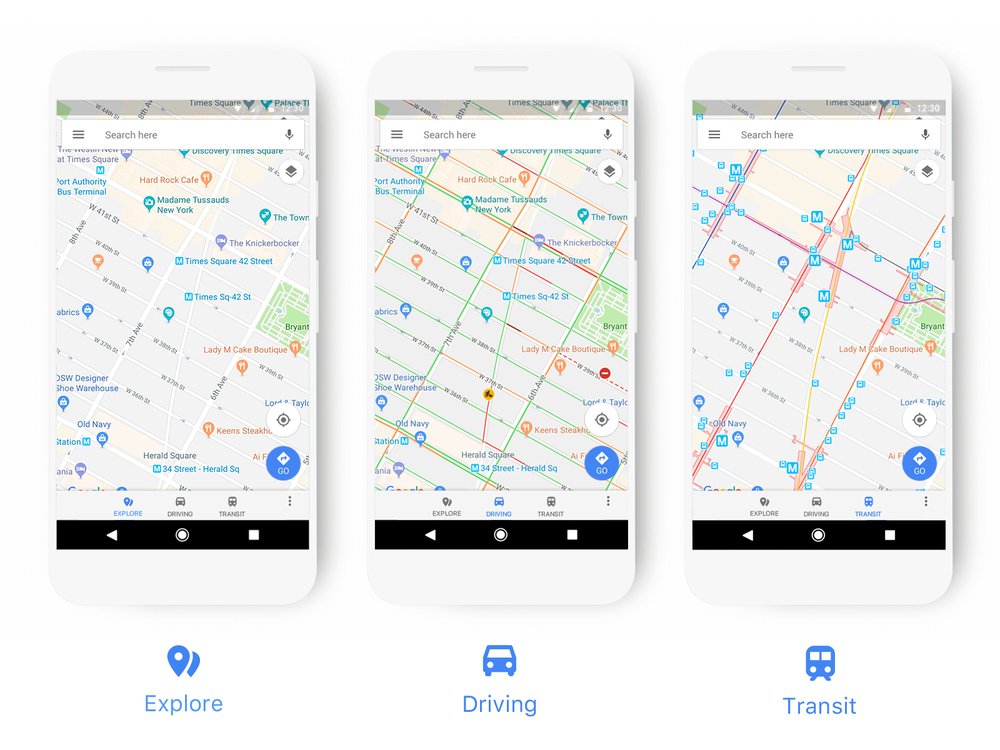
As part of the change, Google Maps will now only highlight points of interest that might be relevant depending on what kind of map is selected (driving, navigation, transit, and so on). For example, gas stations will now show up on the navigation map, while train stations will be prominently displayed when viewing the transit map.
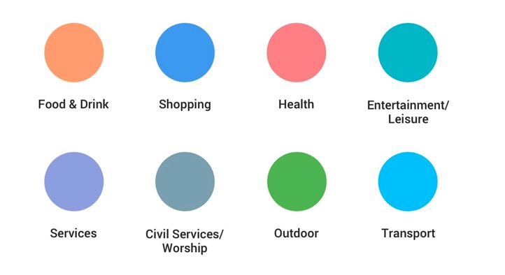
Google has also updated the color scheme and added new icons to help users quickly identify exactly what kind of point of interest they’re looking at. Places like a cafe, church, museum or hospital now have a designated color and icon, making it easier to find that type of destination on the map.

Google says it will rolling out the changes to all of its products that incorporate Google Maps, including Assistant, Search, and Earth. The new style will also eventually appear in the apps, websites and experiences offered by companies that use Google Maps APIs, in order to provide a consistent experience.
Google Maps can be downloaded from the App Store for free. [Direct Link]


